Department of Health
Rebrand
Washington State Department of Health
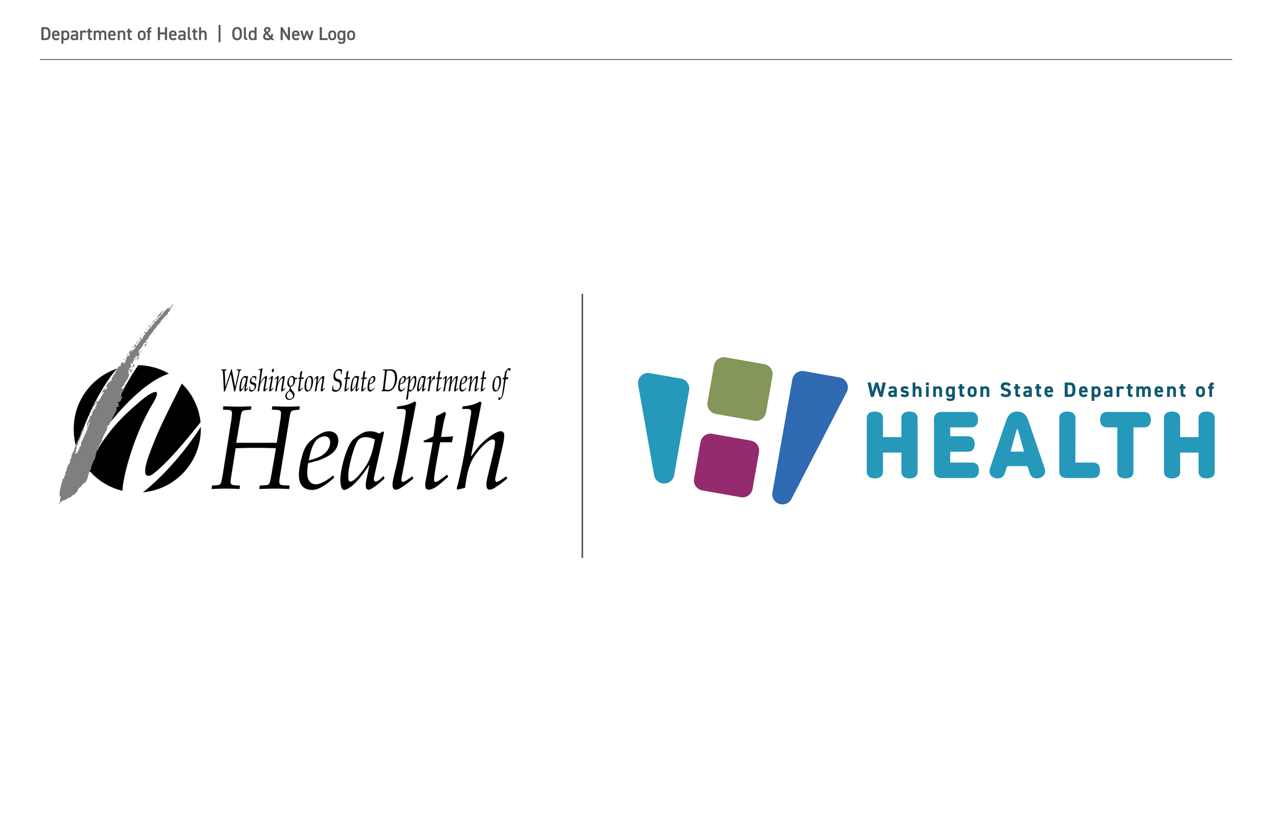
For over 30 years, our agency had an identity that featured a knocked out circle with a brushstroke to evoke a lowercase h. Through the years, this logo gained recognition but was also viewed as difficult to read because of its italicized lettering and the form of the icon. In recent years, the governor charged our agency with reimagining public health - and with this, reimagining a brand that felt modern, inclusive and designed for digital spaces was imperative to this new vision of public health in Washington state.
Concepting & Brand Development
For the agency rebrand, our team developed over 30 concepts over a span of two months. This was a fast-paced rebrand targeted to meet the goal of launching along with the revamped website in the new year.
Throughout the process, this was one of my favorite concepts. Combining the imagery of a W, H and the state silhouette in a minimalist way - this logo gives the agency a fresh, modern look that is more accessible to all Washingtonians.

